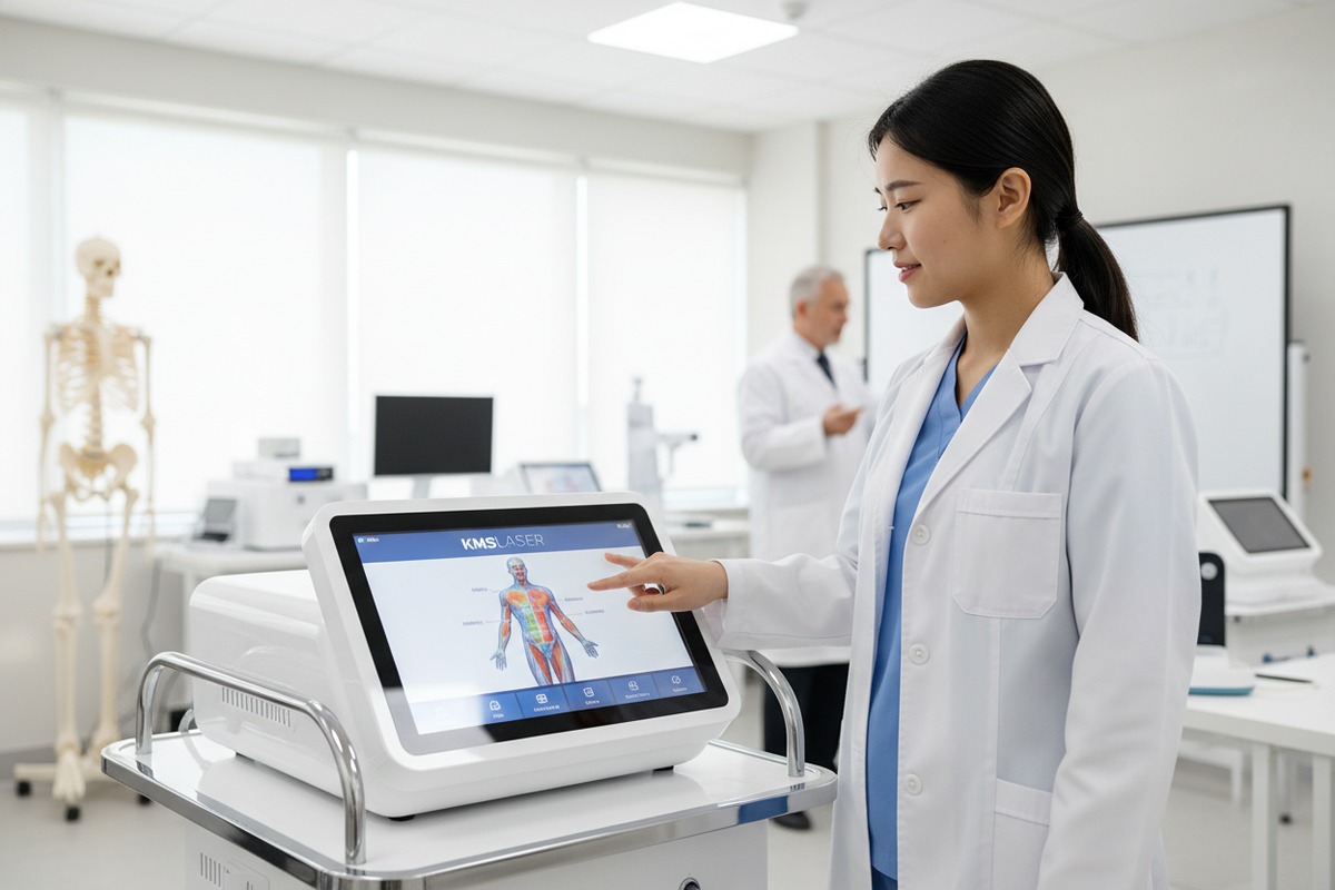
When our engineering team designs shockwave therapy machines 1, we constantly hear from training programs struggling with complex interfaces. Students waste precious lab time navigating confusing menus instead of learning proper treatment techniques medical device design 2. This frustration leads to errors, slower skill development, and even safety concerns.
A shockwave therapy machine interface is user-friendly for students when it features intuitive touchscreen navigation, visual anatomical maps for quick protocol selection, preset treatment libraries, real-time feedback displays, and minimal steps to begin therapy—all reducing cognitive load while supporting safe, hands-on learning for novice practitioners.
In this guide, I will walk you through the exact criteria our team uses to evaluate UI friendliness. You will learn what to test, which features matter most, and how to match interface design with your students’ learning needs.
How can I evaluate if the software layout is intuitive enough for my students to learn quickly?
When we test our production units before shipping, we always simulate first-time user scenarios. Many educators purchase machines with impressive specs but overlook how the software layout impacts student learning curves. A cluttered interface creates confusion and slows down skill acquisition.
To evaluate software layout intuitiveness, test how quickly a complete beginner can navigate from power-on to first treatment. Look for visual hierarchy, logical menu grouping, minimal text dependency, and under-three-tap access to common functions. Setup time under 10 seconds indicates strong learnability for students.

The 10-Second Rule for Student Setup
Our quality control team applies a simple benchmark: can a student reach treatment mode within 10 seconds? This matters because lengthy navigation creates cognitive overload. Students lose focus when they scroll through 50+ menu items to find a single protocol.
Modern machines use visual body maps instead of text lists. A student taps on the shoulder area, and relevant protocols appear instantly. This visual approach reduces memorization demands. Text-heavy interfaces force students to remember condition names in specific languages, creating barriers for international learners.
Key Layout Elements to Test
| Layout Element | Student-Friendly Design | Poor Design |
|---|---|---|
| Menu Structure | 2-3 levels maximum | 5+ nested menus |
| Protocol Access | Visual body map selection | Alphabetical text lists |
| Home Screen | Clear start button, status display | Crowded with advanced options |
| Icon Size | Large, glove-compatible (15mm+) | Small, touch-sensitive only |
| Color Coding | Consistent meaning (green=go, red=stop) | Random or decorative colors |
Cognitive Load Assessment
Students in physical therapy or sports medicine programs already manage heavy course loads. The interface should reduce mental effort, not add to it. We recommend testing with Nielsen's usability heuristics 3, specifically "recognition rather than recall." Students should recognize what to do next rather than remember complex sequences.
Ask three questions during evaluation: Does the student hesitate at any screen? Do they need to ask for help? Can they repeat the process without guidance? If hesitation exceeds five seconds at any point, the layout needs improvement.
Testing Methodology for Educators
Run a simple trial with five students who have never used the machine. Record their time-to-first-treatment and count errors. Compare results across different machines if possible. This hands-on data reveals more than any spec sheet. Our experience shows that visual interfaces cut training time by 40% compared to text-based systems.
What specific UI features should I look for to ensure my trainees can operate the machine safely?
Safety ranks as our top priority when our R&D team develops new interfaces. We have seen training programs face serious issues when students accidentally apply incorrect energy levels. The right UI features act as guardrails that protect both students and simulated patients.
Essential safety UI features include guided step-by-step workflows, parameter limit warnings, real-time energy and frequency displays, clear start/stop controls, treatment countdown timers, and automatic shutoff protocols. These features prevent common student errors like over-treatment or incorrect intensity selection.

Guided Workflow Systems
Wizard-style interfaces walk students through each treatment step. The screen shows what to do now, what comes next, and what parameters are active. This reduces skipped steps, a common error when students feel rushed or distracted.
Our machines include confirmation prompts before treatment begins. The student must verify patient area, energy level, and pulse count. This forced pause catches mistakes before they matter.
Real-Time Parameter Displays
Students need constant visual feedback during treatment. The screen should show:
- Current energy level (displayed in mJ)
- Active frequency (Hz)
- Pulse count delivered versus target
- Time remaining in session
- Treatment area indicator
Without these displays, students cannot self-correct during operation. They may complete a session without realizing settings drifted from the protocol.
Safety Feature Comparison Table
| Safety Feature | Benefit for Students | Implementation Example |
|---|---|---|
| Energy Limit Locks | Prevents accidental high-intensity application | Maximum 185 mJ cap with warning at 80% |
| Countdown Timers | Creates clear session boundaries | Visual and audio cues at 30-second marks |
| Emergency Stop | Immediate treatment halt | Large red button, single-tap activation |
| Parameter Confirmation | Catches setup errors | Required verification before start |
| Auto-Shutoff | Prevents overuse | Automatic stop at preset pulse count |
| Light Indicators | Non-screen status awareness | LED changes color with intensity level |
Ergonomic Handpiece Controls
Students should maintain focus on the treatment area, not constantly look at the main unit. Ergonomic handpieces with integrated controls allow start/stop and basic adjustments without shifting attention. This reduces application inconsistencies and improves technique development.
Our handpiece designs include textured grips for stability during extended practice sessions. Students experience fatigue during long lab periods, and comfortable equipment prevents grip slippage that could cause unsafe application angles.
Accessibility and Error Prevention
Consider students with diverse needs. Adjustable font sizes, high-contrast color schemes, and audio feedback support various learning styles. Color-blind students may struggle with red/green indicators alone, so shapes or sounds should accompany color cues.
The interface should make correct actions easy and incorrect actions difficult. This principle from human factors engineering 5 applies directly to medical device design. Menus should gray out inappropriate options rather than allowing selection followed by error messages.
Can I customize the interface with my own branding to maintain a professional look for my training program?
During production discussions with our OEM partners, interface customization always comes up. Training programs want their machines to reflect institutional identity. This is not just vanity—branded equipment creates cohesive learning environments and reinforces program professionalism.
Many shockwave therapy machines offer interface customization including logo placement, color scheme adjustments, welcome screen personalization, and custom protocol naming. These OEM/ODM options allow training programs to maintain brand consistency while using manufacturer-designed core functionality and safety systems.

What Can Typically Be Customized
Our customization services cover several interface elements. The startup screen can display your program logo and name. Color accents can match institutional branding guidelines. Protocol libraries can use your preferred naming conventions for conditions and treatments.
However, core safety elements remain standardized. Warning displays, emergency stops, and parameter limits follow regulatory requirements 6. Customization enhances appearance without compromising function.
Customization Options Overview
| Customization Level | Elements Included | Typical Requirements |
|---|---|---|
| Basic Branding | Logo on startup, institution name | Image file, text input |
| Color Themes | Accent colors, button highlights | Hex codes or color selection |
| Protocol Naming | Custom condition names, treatment labels | Text database modification |
| Welcome Screens | Personalized greetings, program information | Design templates |
| Advanced ODM | Complete interface redesign | Engineering collaboration, higher MOQ |
Benefits for Training Programs
Branded equipment signals investment in quality education. When students use professionally customized machines, they perceive the training as serious and valuable. This psychological factor improves engagement and learning outcomes.
Consistency also reduces confusion. If your program uses specific terminology for conditions, having that language on the machine interface eliminates translation mental effort. Students focus on technique rather than vocabulary differences.
Working with Manufacturers on Customization
Request customization samples before committing to orders. Ask about minimum order quantities for custom interfaces, as some modifications require higher volumes. Clarify turnaround times—software changes typically move faster than hardware modifications.
Our team provides mockups showing exactly how your branding will appear. This preview prevents surprises at delivery. We also maintain your custom profile for reorders, ensuring consistency across equipment batches.
Limitations to Expect
Complete interface redesigns require ODM-level collaboration and higher investment. Basic branding fits most training program needs without extensive engineering involvement. Regulatory compliance means certain elements cannot change, particularly safety displays and measurement units.
Does the screen provide clear visual feedback and preset protocols to help my students avoid technical errors?
Our engineers spend considerable time on feedback display design. We know that students cannot correct what they cannot see. Clear visual feedback transforms the learning experience from guesswork to informed practice.
Effective screens display real-time treatment progress through pulse counters, energy graphs, frequency indicators, and anatomical treatment maps. Preset protocol libraries with 18+ indications provide parameter recommendations, reducing student guesswork and ensuring treatments align with established clinical guidelines.

Real-Time Feedback Elements
The best training interfaces show treatment progress continuously. Students see pulses delivered counting upward, energy levels displayed graphically, and time remaining in countdown format. This constant information stream allows immediate self-assessment.
Light signatures on modern machines provide non-screen feedback. The handpiece or main unit changes color or brightness based on intensity. Students develop peripheral awareness of treatment status without staring at screens.
Preset Protocol Libraries
Presets eliminate parameter memorization for common conditions. When a student selects "plantar fasciitis 7," the machine automatically suggests appropriate energy, frequency, and pulse count. This guidance prevents arbitrary parameter selection that could lead to ineffective or unsafe treatments.
Quality preset libraries cover 18 or more indications:
- Tennis elbow (lateral epicondylitis)
- Plantar fasciitis
- Achilles tendinopathy
- Myofascial trigger points
- Calcific shoulder tendinitis
- Patellar tendinopathy
- Hip bursitis
- Shin splints
Feedback Quality Comparison
| Feedback Type | Student Learning Benefit | Screen Implementation |
|---|---|---|
| Pulse Counter | Tracks treatment completion | Large numeric display, progress bar |
| Energy Graph | Shows intensity consistency | Real-time line graph |
| Frequency Display | Confirms correct setting | Hz value with visual indicator |
| Body Map Highlight | Confirms treatment area | Anatomical diagram with active zone |
| Timer Display | Manages session length | Countdown with audio alerts |
| Protocol Recommendations | Guides parameter selection | Suggested ranges with rationale |
Integrated Assessment Tools
Advanced interfaces include patient assessment features. NRS pain scales and ROM measurement tools appear on-screen. Students learn to document outcomes alongside treatment delivery. This integration teaches complete clinical workflow rather than isolated device operation.
History tracking lets students review previous sessions. They can compare parameter choices and outcomes, developing pattern recognition for treatment optimization. This data-driven learning accelerates skill development beyond simple repetition.
Balancing Presets with Learning
Some educators worry that preset-heavy interfaces create dependency. Students might not learn to adjust parameters independently. The solution involves progressive exposure—begin with strict preset guidance, then introduce manual adjustment opportunities as skills develop.
Our interfaces allow preset modification after initial selection. Students see recommended values, understand their basis, then practice making informed adjustments. This scaffolded approach builds confidence without sacrificing safety.
Screen Specifications That Matter
For classroom environments, screen size affects group visibility. Seven-inch or larger displays with high-resolution color allow multiple students to observe demonstrations clearly. Glove-compatible touchscreens with large icons (15mm minimum) ensure functionality during hands-on practice sessions.
Anti-glare coatings reduce eye strain during extended lab periods. High contrast between text and background improves readability under variable lighting conditions common in training facilities.
Conclusion
Evaluating shockwave therapy machine interfaces for student use requires testing setup speed, safety features, customization options, and feedback quality. The right interface reduces cognitive load, prevents errors, and accelerates skill development. When selecting equipment for your training program, prioritize visual navigation, guided workflows, and comprehensive preset libraries that support learning without limiting growth.
Footnotes
1. Provides general information about shockwave therapy machines and their applications. ↩︎
2. Provides context on the design principles and standards for medical equipment. ↩︎
3. Introduces a widely recognized framework for evaluating user interface usability. ↩︎
4. Explains the concept of mental effort and its implications for learning. ↩︎
5. Defines the discipline focused on optimizing human-system interaction in healthcare. ↩︎
6. Explains the importance of compliance and regulations for medical devices. ↩︎
7. Offers detailed medical information on a common condition treated by shockwave therapy. ↩︎
8. Discusses the importance of standardized protocols for safe and effective medical device usage. ↩︎

 English
  Español de México
  Deutsch
  Français
  العربية
  Русский